From 0.5% to 4% Conversion Rate
How user research, a segment-specific landing page, and a checkout rebuild improved a weak paid-acquisition funnel for a hormonal-health course.
This was a standalone project where I operated as a one-person growth team.
I owned customer research, strategy, copywriting, landing page UX and UI, WordPress and WooCommerce implementation, checkout customization, tracking architecture, email flows, and Meta ads execution.
The client owned the product, pricing, workshop delivery, and the ongoing subscription experience.
 WordPress
 WooCommerce
 Stripe
 GTM
GTM
 PostHog
 FluentCRM
 Brevo
Brevo
CVR = completed course purchases divided by paid unique sessions, measured in PostHog and cross-checked against WooCommerce order records.
CAC = Meta ad spend divided by attributed course purchases.
Front-end ROAS = initial course revenue divided by Meta ad spend, excluding fees, fixed costs, and subscription revenue.
All figures come from Facebook Ads Manager, PostHog, Clarity, WooCommerce, and FluentCRM data.
Attribution note: V2 changed the audience targeting, the landing page, and the checkout at the same time.
The 8x figure is an observed business outcome from a funnel relaunch, not the causal result of a controlled A/B test. I address this fully in the Results and Limitations sections.
A ~$70 live course based on the Aviva Method, a hormonal-health practice with roots in Hungary but little awareness among the Romanian target audience. No brand, no email list, no owned traffic. The entire conversion journey had to be built from zero.
The V1 landing page, and the Meta campaigns behind it, tried to address five distinct audiences at once: fertility, menstrual pain, hormonal imbalance, perimenopause, and menopause. That weakened message match between ad and page, and V1 converted at 0.5% across 1,167 paid unique sessions in its first four weeks.
I used scroll and session data from Microsoft Clarity to diagnose where and why visitors were leaving, then a 110-respondent survey to rank segments by demand. Based on that evidence, I rebuilt the funnel around a dedicated Fertility landing page with matching ad messaging, and removed checkout friction through custom account automation.
On a comparable four-week paid cohort of 1,178 unique sessions, the Fertility funnel reached a 4.0% CVR, versus 0.5% for the generic V1 baseline.
Roughly $900 in Meta ad spend generated 47 course enrollments at a ~$19 cold-traffic CAC and ~3.6x front-end ROAS.
Additionally, 40% of buyers upgraded to the client’s $60/month recurring practice subscription, and half of those subscribers remained active for 4 to 5 months, turning a $70 front-end product into a recurring revenue stream. Subscription revenue is reported separately from front-end ROAS, since long-term retention was also shaped by the client’s course delivery and community.
Full-Funnel Marketing Strategy & Blueprinting in Miro
Before launch, I mapped the audience hypotheses, message angles, offer structure, channel plan, and page architecture in Miro. The first strategic decision was to launch one broad MVP rather than build multiple funnels before any paid-data baseline existed. The purpose of V1 was to validate initial demand, observe real user behavior, and let evidence decide where segmentation would have the greatest commercial impact.
Miro Blueprint Snapshots
Full strategy, flows & components designed before development.
Building V1 and the Measurement Infrastructure
The goal of V1 was not perfection. It was to get a functional, measurable funnel live fast and start collecting behavioral evidence from real paid traffic.
I chose WordPress and WooCommerce for long-term client autonomy, deployed on a dedicated VPS with Varnish caching instead of shared hosting, and tuned the build to load in under 1.5 seconds on mobile before any paid traffic hit the page.
V1 was intentionally built as one broad page: it introduced the method, explained the course, established baseline trust, and tested whether a shared message could convert adjacent audience needs. The copy followed a Problem, Agitate, Solution structure, mirroring the physical symptoms and emotional anxieties of the audience.
The launch was never meant to be the final funnel. It was a baseline designed to reveal which audience-message combinations deserved dedicated investment.
I deployed PostHog and Microsoft Clarity through a custom GTM data layer, built the purchase funnel in PostHog, and configured Clarity to capture scroll behavior and session recordings. This setup provided the behavioral and funnel evidence used throughout this case study.

Launching V1 and Letting the Data Challenge the Initial Approach
The first Meta campaigns and the V1 page addressed all five audience segments with generalist messaging. The client initially needed one page that could speak to the whole market, and I agreed to use that broad approach as a measurable MVP, with the expectation that paid-traffic data would determine whether segmentation was necessary. The data answered fast.
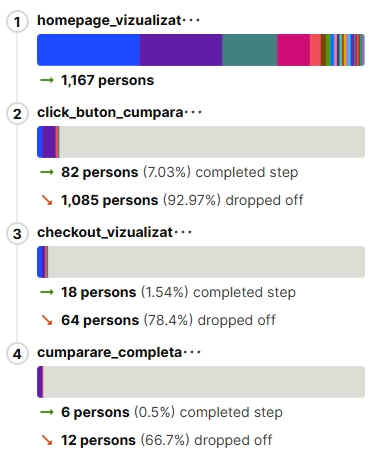
To make the V1 diagnosis more granular, I tracked four distinct steps: landing-page view, course CTA click, checkout view, and completed purchase. The course CTA did not send visitors straight to checkout. Instead, it scrolled them to a dedicated offer-review section further down the page, where visitors could review the workshop, pricing, and reassurance elements before deciding to start checkout.
This separation was intentional. The landing page presented the course offer in detail, so visitors could understand what it included, assess its relevance, and evaluate the price before committing. Checkout was reserved for the final purchase decision: reviewing the order and completing payment.
The results showed that the biggest drop-off happened before checkout. Of 1,167 visitors, 82 (7.03%) clicked the course CTA and reached the offer section, but only 18 continued to checkout. This suggested that the V1 page was not giving most cold visitors enough reason to move from initial interest to purchase intent.
Of the 18 visitors who reached checkout, 6 completed a purchase, a 33% checkout-to-purchase rate and a 0.5% overall CVR. The checkout sample was small, so it could not prove a specific cause. But the four-step funnel made the priority clear: first improve the problem-to-solution match, then reduce friction in the final checkout step.
This became the core hypothesis behind the segmented V2 funnels.
Conclusion: don’t keep fixing one generic page. Split the funnel by audience need, starting with the segment the data said mattered most, and align ad, page message, proof, offer, and checkout around that single audience.
Choosing the Segment With Data, Not Opinions
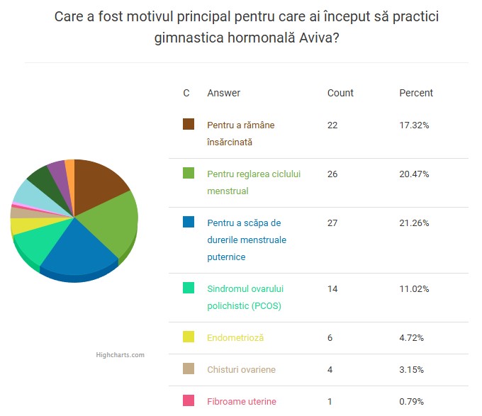
To decide which segment to build first, I created a diagnostic questionnaire. The client shared it inside the WhatsApp communities of the Hungarian Aviva Association, which produced 110 responses from women who had already practiced the method.
Based on that, I planned three dedicated landing page directions and started with fertility, which combined the strongest demand signal with the most emotionally specific paid-media message.
A note on sample bias: these respondents were existing Hungarian practitioners, not cold Romanian prospects, so the sample carries survivorship bias and a market mismatch. It was still the closest available proxy to real buyers, and far more informative than choosing a segment on intuition.
The Fertility Funnel (V2)
I built a dedicated Fertility landing page and pointed a dedicated Fertility Meta campaign at it, so ad promise and page message finally matched, from click to checkout. I then refined the page using Clarity session recordings.
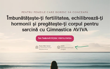
The CTA became action-led and fertility-specific: “Improve my fertility.” Under it, I anchored trust with “150+ women completed the Aviva workshop” (the brand’s cumulative historic participant base across all markets, independent of this campaign’s 47 enrollments), a 5.0/5 Google rating, and a first-screen Google review from a woman who conceived after 7 months, which session recordings showed users actively expanding to read in full.
Instead of broad hormonal messaging, the copy walks through what happens if you keep waiting and hoping, across fertility, relationships, and emotional health, with consequences specific to women actively trying to conceive: failed IVF cycles, strained intimacy, month after month of negative tests.
Same persuasion backbone as V1, but now surgically relevant to one audience instead of vaguely relevant to five.

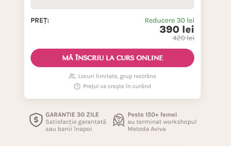
The workshop card lists inclusions, date, place, and discount at a glance. Around the price, I stacked standard urgency and risk-reversal elements: limited spots in a small group, a price increase notice, a 30-day money-back guarantee next to the CTA, and the 150+ proof repeated.
The button uses localized action copy: “Sign up for the workshop in Brașov.”
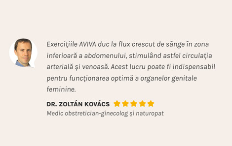
Beyond participant reviews, I added a practicing doctor’s testimonial and references to the wider Aviva ecosystem, supporting perceived credibility through both practitioner and peer proof.
Custom Checkout Redesign (WooCommerce)
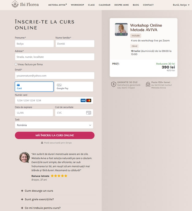
PostHog identified checkout as a high-intent friction point: once users entered the purchase flow, the native WooCommerce checkout forced manual account creation, password setup, and password re-entry before payment.
The user enters only email and payment details. A custom script generates the WordPress account in the background and emails secure access instructions.
Instead of a plain line item, a visual product card with photo, date, discounted price, and inclusions keeps the value proposition on screen while the user types.
A “Secured by Stripe” badge under the CTA, the 30-day guarantee, and a real client testimonial with photo and rating, placed exactly where the user decides whether to click pay.
FAQ accordions answer common doubts (“Is it hard?”, “How does a class work?”) without sending the user away from the page.
Post-Purchase Email Flow
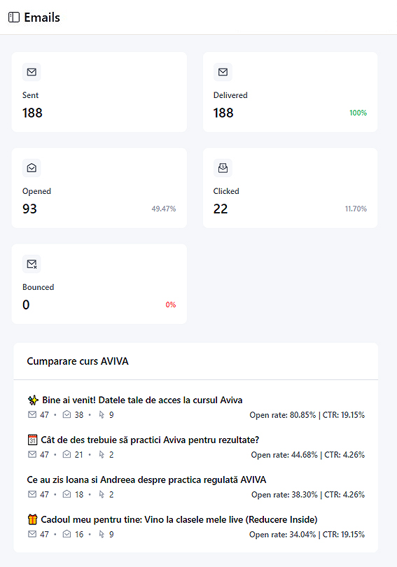
The purchase was the start of the customer journey, not the end. The client’s business model depended on turning one-time course buyers into recurring practice students, so I built a four-email post-purchase sequence in FluentCRM, designed to move buyers from “I attended a workshop” to “I practice Aviva regularly.”
Triggered immediately after payment: enrollment confirmation, purchase details, and clear instructions for accessing the account that was created silently during checkout.
An educational email explaining why the results of the Aviva Method come from consistent practice after the course, not from the workshop alone. No offer, no link to buy.
Two testimonials from women attending the client’s guided online classes. No price, no discount, no CTA to purchase.
A discounted 8-entry practice package (roughly one month of classes, online or in person). The CTA links used shared UTM parameters, allowing sales attributed to the post-purchase sequence to be measured in PostHog.
Contribution note. Nineteen of 47 course buyers (40%) later purchased practice classes. Six sales were directly tracked to links in the four-email post-purchase sequence via shared UTM parameters. The remaining 13 purchases were not directly attributable to email clicks and may also have been influenced by the client’s follow-up. The 40% is a funnel-level outcome, not email-only attribution.
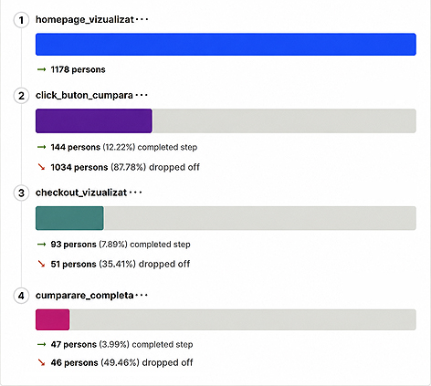
The dedicated Fertility funnel was measured over a comparable four-week paid cohort of 1,178 landing-page visitors. Unlike V1, it did not try to speak to every hormonal-health concern at once. Fertility-focused ads led to a page built around one specific problem, outcome, and purchase context.
As in V1, the primary course CTA did not open checkout immediately. It scrolled visitors down the same page to the detailed offer section, where they could review the course, price, proof, and reassurance elements before choosing whether to start checkout. This made it possible to measure the transition from initial interest, to offer review, to purchase intent.
This directly addressed the main V1 bottleneck. On the generic page, 82 visitors clicked the CTA and entered the offer-review section, but only 18 continued from that section to checkout. In V2, 144 visitors entered the offer-review section and 93 continued to checkout. The offer-review-to-checkout rate increased from 21.95% in V1 to 64.58% in V2.
The improvement was not the result of one page element or a single checkout tweak. The funnel aligned the ad message, landing-page copy, proof, course offer, and purchase path around the same audience need: fertility. This gave cold visitors a clearer answer to three questions before asking them to pay: Is this for my problem? What exactly does it include? Why should I trust it?
The improvement continued through the final step. Of the 93 visitors who reached checkout, 47 completed a purchase, producing a 50.54% checkout-to-purchase rate. This was higher than V1’s 33.33% rate, although the V1 checkout sample was too small to isolate checkout changes as a proven cause.
Overall, the dedicated funnel generated 47 purchases and a 3.99% purchase conversion rate, compared with 6 purchases and a 0.5% rate on V1. The result supported the original hypothesis: for cold traffic, improving the problem-to-solution match before checkout had to come before optimizing the final payment step.
Conclusion: Segmenting the funnel around one high-intent audience need made the journey more relevant from ad click to checkout. The largest improvement came before payment, where far more interested visitors continued from reviewing the offer to starting checkout.
Limitations, and What I'd Do Differently
47 purchases across ~$900 of spend and 1,178 sessions. Directionally strong and internally consistent, but not statistically conclusive at a much larger budget.
V1 to V2 was a coordinated relaunch, not an A/B test. With more budget I would have tested the hero change alone against the full rebuild to quantify each lever.
Four weeks proves the funnel works. It does not yet prove stability at five times the spend or under broader targeting.
The 110 survey respondents were Hungarian practitioners, not cold Romanian prospects. Useful for prioritization, not a representative market study.
The V2 page included several session-recording-led refinements. Because these were not logged as separate experiments, I do not assign individual performance impact to them.